
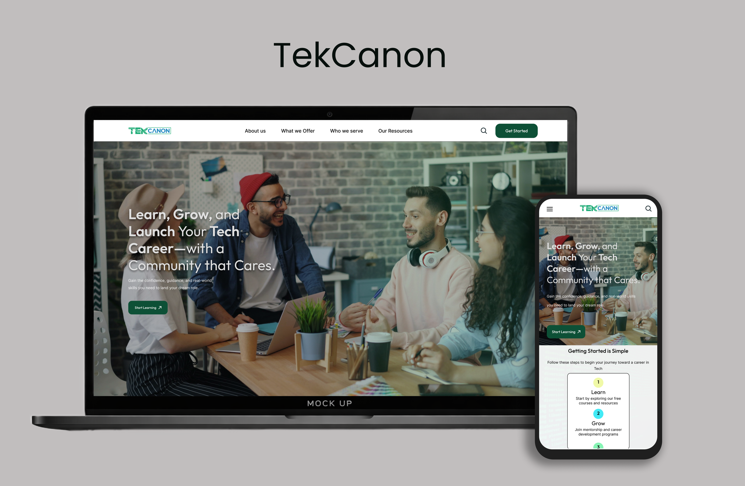
TekCanon is a nonprofit learning platform that provides free tech education and career preparation for underserved individuals and career switchers. The platform offers accessible online courses, resume and interview support, and community-based coaching to help learners build confidence, develop practical skills, and pursue better job opportunities in the tech space.
Timeline
June - August
PROBLEM
My role
UX Researcher,UX Strategist, UI/UX Designer
Scattered and Overwhelming Tech Learning Options
Despite TekCanon’s mission, the existing website created confusion and friction for new users. The experience did not clearly communicate what TekCanon offers or how learners should begin.
Core Problems Identified
Unclear and inconsistent CTAs
Overwhelming homepage with repeated content and no visual hierarchy
No hero image or emotional storytelling
Navigation lacked hierarchy and guidance
No clear explanation of TekCanon’s services or nonprofit identity
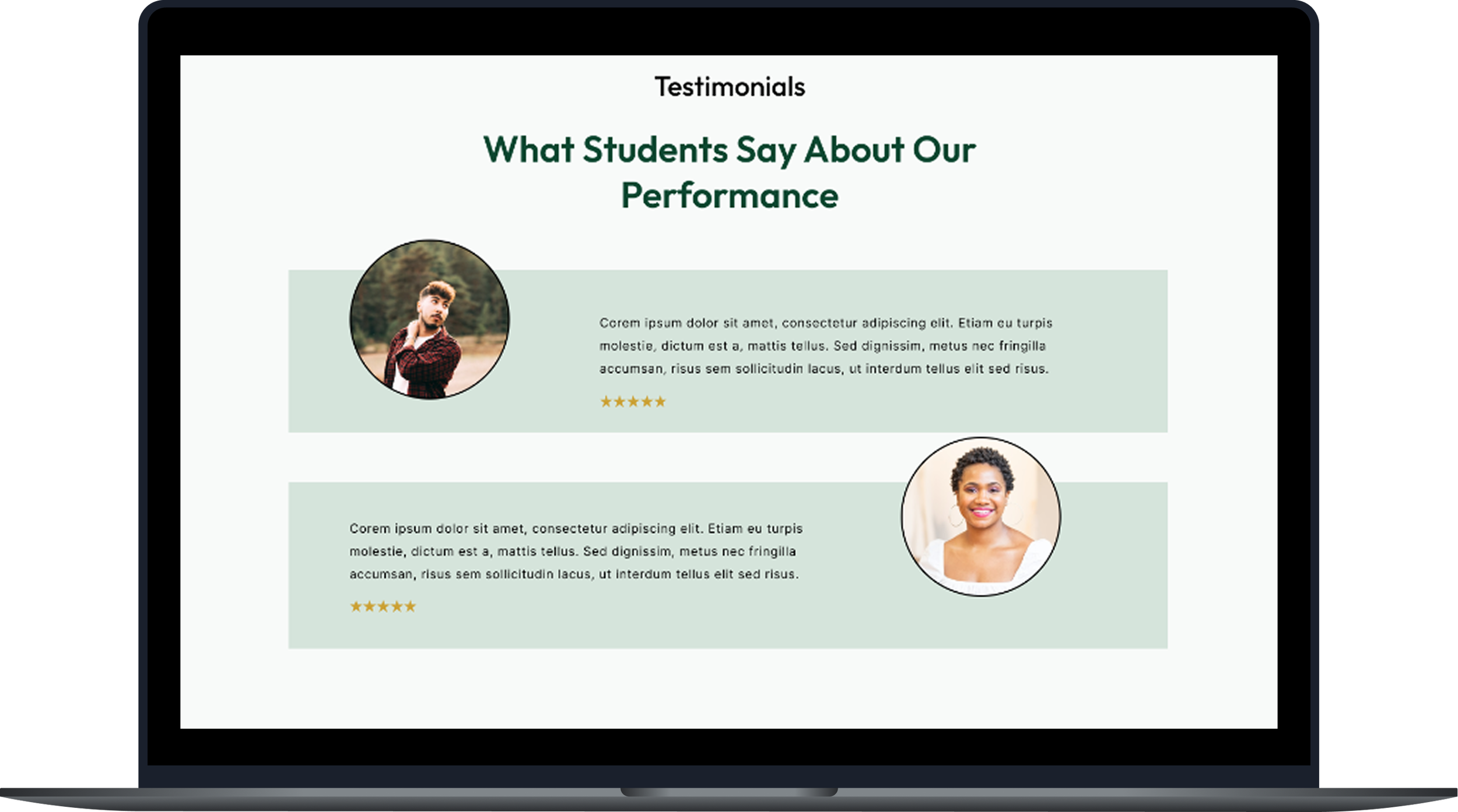
Weak trust-building elements (no testimonials, no mission clarity)
These issues caused confusion, early drop-off, and reduced trust — especially for underserved learners and career switchers who already struggle with confidence.
THE SOLUTION
A Clear, Supportive, and Guided Learning Experience
I redesigned the TekCanon website to create a clearer, more supportive, and nonprofit-aligned experience that guides users confidently from landing to learning.
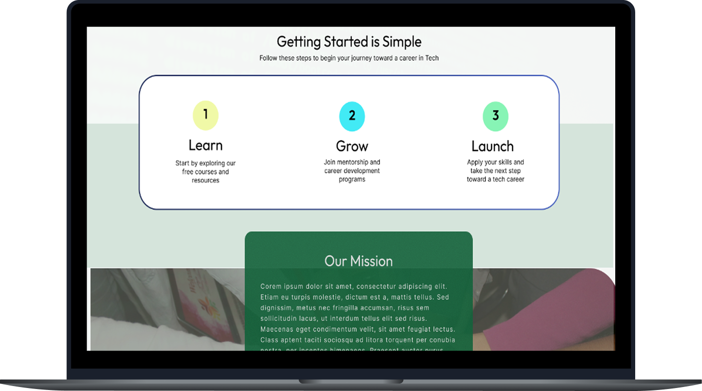
Structured and Beginner-Friendly
Introduced a strong hero section with a community-centered image
Simplified homepage into purposeful sections with visual hierarchy
Added a primary CTA: “Start Learning”
Reduced redundancy and visual clutter in course listings
Tool kit: Figma, Adobe CC, FigJam
Community-Centered, Trust-Building Experience
Shifted tone from corporate/startup to warm, nonprofit, and mission-driven
Highlighted coaching, mentorship, and community support earlier
Used softer colors, rounded shapes, and human-centered imagery
Added space for testimonials and impact stories
WHITE PAPER RESEARCH
A way to achieve goal with 95% success…
To ground the redesign in evidence-based UX principles, I conducted white paper research focused on adult learners, career switchers, and trust in online education platforms. Article
“Adult learners are significantly more likely to disengage from learning platforms when interfaces lack clear structure, guidance, and trust signals.”
(OECD, 2020)
COMPETITIVE ANALYSIS + GAP
TekCanon is falling short in areas where competitors excel.
I conducted a site audit of TekCanon and analyzed comparable platforms (The Muse, Codecademy, LeetCode) to identify UX gaps.

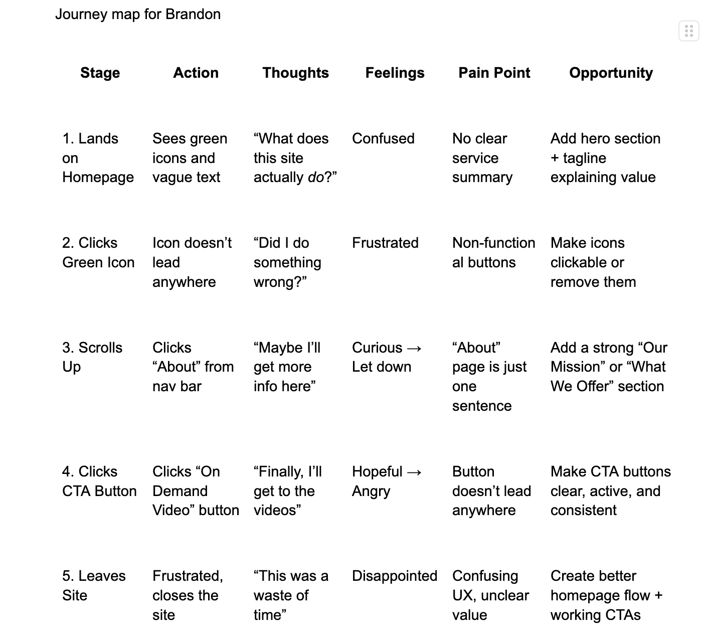
USER JOURNEY ANALYSIS
What the users experienced
Key Journey Gaps
Users don’t immediately understand what TekCanon offers.
CTAs feel unclear or don’t work, reducing trust.
Content feels overwhelming without hierarchy or flow.
Navigation makes exploration harder than it should be.
The experience lacks emotional connection and reassurance.
THE MAIN INSIGHT
Unclear value and broken interactions causes users to lose trust and leave quickly.
When key interactions lack clarity and functional feedback, users quickly lose trust, become frustrated, and abandon the platform before understanding its value.
MAJOR INSIGHTS
Theme 1: Clarity builds confidence
Users need to understand what TekCanon offers within seconds of landing.
Theme 2: Direction matters more than abundance
Too many options without guidance leads to inaction
Theme 3: Emotional safety is critical
Career switchers need reassurance, not intimidation.
Brandon the Career switcher

27 year old | Insurance Agent
User Story
“As someone trying to break into tech from a non-traditional background, I need a platform that guides me clearly, builds my confidence, and helps me take action without feeling overwhelmed.”
Goals
Learn practical tech skills to land a job
Understand what TekCanon offers within seconds
Access coaching and resume help easily
Feel supported throughout the journey
Motivation
Wants a stable, fulfilling career in tech
Feels inspired by success stories of others who made the switch
Values clarity, structure, and emotional reassurance
Pain Point
Confused by vague CTAs and unclear homepage messaging
Overwhelmed by dense content with no visual hierarchy
Frustrated by broken buttons and poor navigation
Feels uncertain about TekCanon’s value compared to free resources
TESTING + IMPROVENTS
3 Major improvements in my design
Through continuous iteration, I refined the design by creating a more mature interface, organizing information more clearly, and simplifying navigation to better support career switchers and underserved learners exploring TekCanon’s resources.

Navigation Usability
Added a fixed top navigation bar so users can reach key pages without scrolling.
Reorganized navigation to make key pages easier to find based on user feedback and task priority.
Clarified navigation labels and CTA purposes to reduce confusion and show where each action leads. Quality of key pages
Visual Consistency & Accessibility
Adopted a balanced, accessible color palette that improved readability and supported a cohesive brand identity.
Applied consistent visual patterns—including typography, spacing, and iconography—to create a predictable and intuitive experience across pages.
Improved accessibility by increasing text contrast, simplifying layouts, and ensuring key elements remained clear for users with diverse visual or cognitive needs.
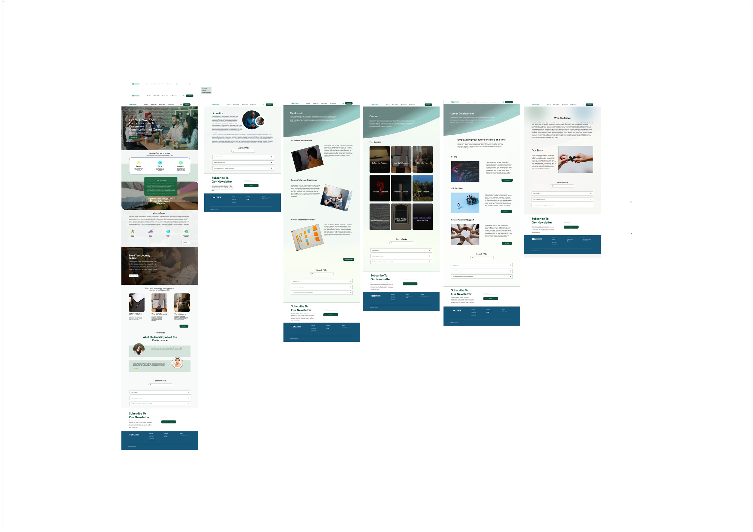
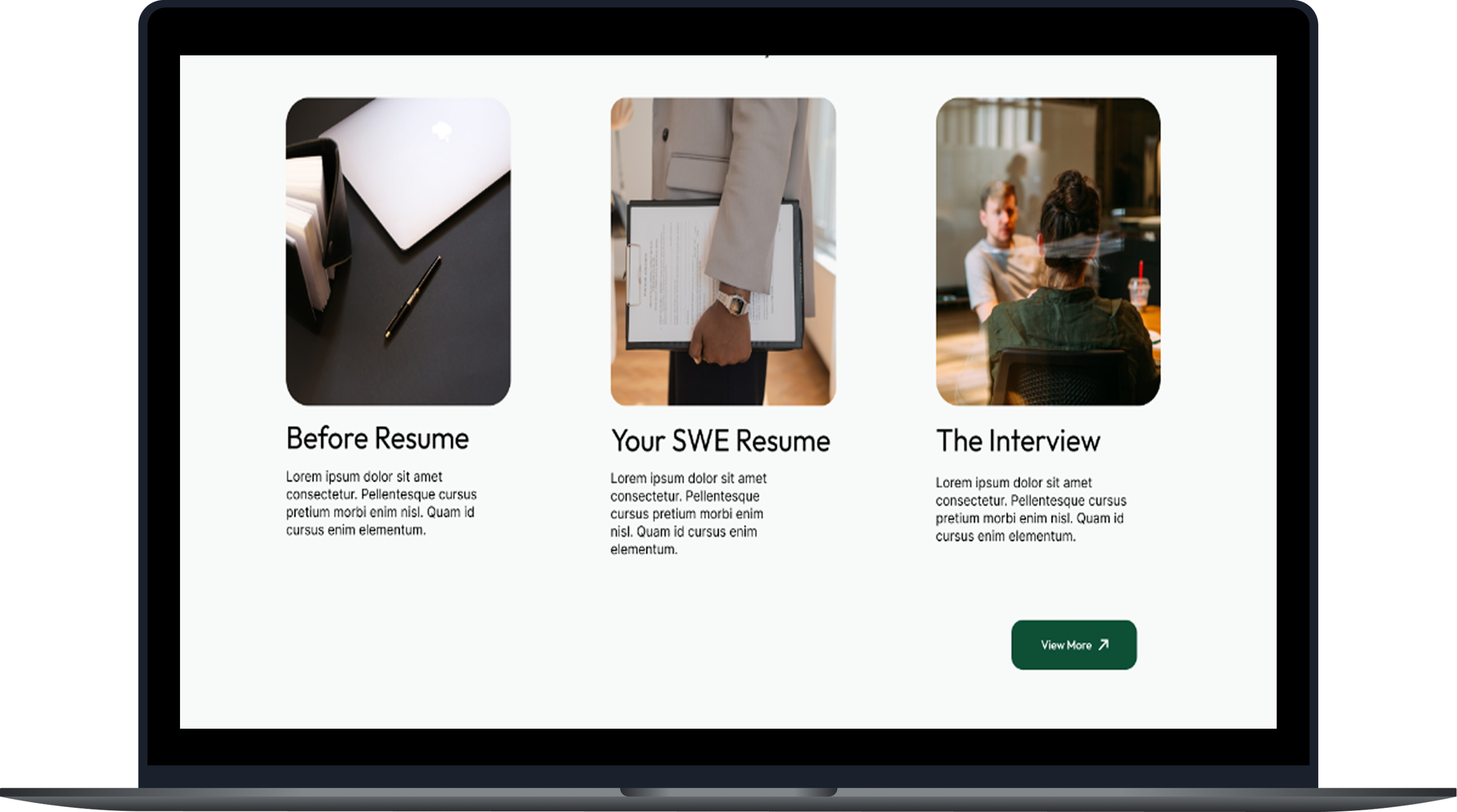
The Final Screens
Final Deliverables
CTA Clarity
Clarified CTA labels so users instantly knew each action and felt less confused.
Added short helper text under main CTAs to explain them and guide users to the next step.
Clarified layout—adjusted sizes, spacing, and placement so key actions stand out and tasks are easier to complete.
SETBACKS + A NEW DIRECTION FOR TEKCANON’S DESIGN
These constraints shaped a design focused on clarity, warmth, and accessibility.
Transitioning TekCanon’s identity to a nonprofit tone
Balancing simplicity with showcasing multiple services
Designing for users with low tech confidence
Ensuring consistency across pages with different original layouts
CONCLUSION + LESSON LEARNED
This redesign strengthened my ability to create mission-aligned, user-centered experiences for underserved learners.
Conduct usability testing earlier
Test multiple homepage messaging variations
Validate assumptions with direct user interviews
In conclusion…
What I’d do differently next time
Clear structure empowers users
Nonprofit UX needs empathy and clear calls to act
Simplicity often creates the biggest impact
I hope you enjoyed exploring this project! I’m always open to feedback, collaboration, or just a good conversation about UX. You can reach me at eskaychinaza8@gmail.com
Thank you for reading!